our Brand
Welcome to Stokeshire Designer Doodles, where passion, purpose, and exceptional canine companions come together. Rooted in faith, family, and a deep respect for creation, our mission is to provide families with dogs that inspire joy, purpose, and adventure.
Our Heritage and Inspirations
Our heritage is as beautifully mixed as the dogs we raise. With roots in the English Midlands, a love for the Midwest, and inspiration drawn from Utah’s Beehive State and Pioneer spirit, our traditions celebrate the blend of past and present. During the winter, we embrace Scandinavian simplicity and the cozy Danish concept of Hygge, fostering warmth and connection in all we do.
Brandmark
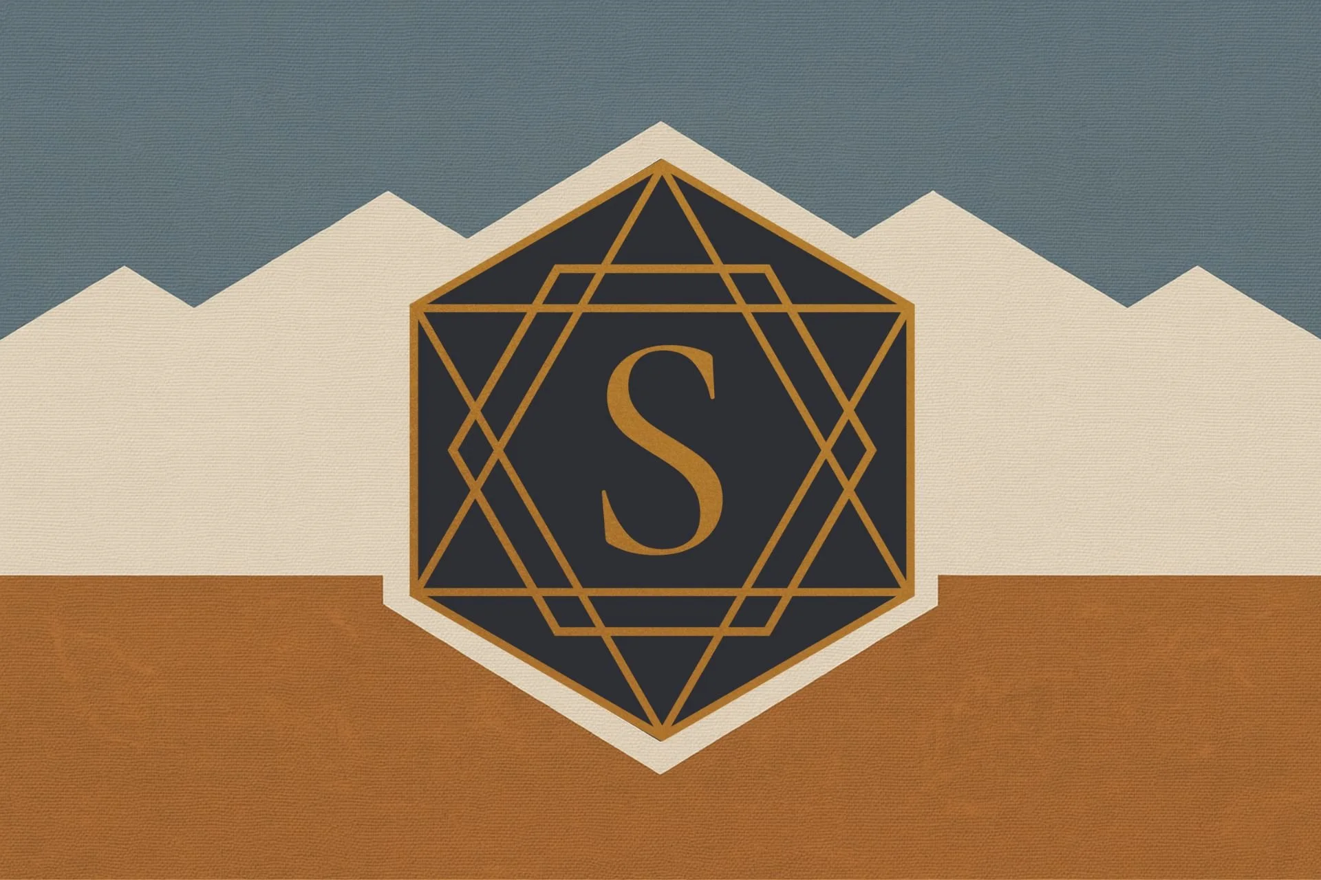
At the heart of Stokeshire's identity is our logo: two triangles, one upright and the other inverted. This geometric design symbolizes male and female principles, a timeless representation in alchemy and astrology. Together, the triangles form the Shield of David, a nod to our spiritual heritage and unwavering faith in Jesus Christ.
The resulting star creates a hexagon, mirroring the intricate structure of DNA, the blueprint of life. This design reflects our admiration for creation’s complexity and harmony, honoring the divine artist and designer who makes all things possible.
Wordmark
The name Stokeshire carries rich historical and personal significance. It originates from the English Midlands, where our family name has its roots.
Stoke: Derived from the Old English word stoc, it conveys a sense of place, encompassing meanings like a farm, summer pasture, crossing place, meeting place, and even a place of worship. For us, it is all these things—a representation of our connection to the land and our commitment to approach every aspect of life as an act of worship, inspired by 1 Thessalonians 5:18.
Shire: Paying homage to our English Mercian ancestry and traditional rural culture, "Shire" embodies a sense of community and nostalgia. It’s also a tribute to our love of Tolkien’s Lord of the Rings.
Additionally, our brandmark subtly incorporates the Saltire or Saint Andrew's Cross, reflecting our Scottish heritage.
Our Visual Identity
Our carefully curated color palette—muted Copper, Harbor Grey Blue, Magic Black, Elder White, and Slate Grey—encapsulates the serene beauty of a fall day in Wisconsin and the landscape of Utah. Imagine a Bernese Mountain Dog standing watch over a flock of sheep against a soft grey sky. These colors are more than a visual choice; they evoke the emotions and values that define our brand: balance, trust, and quality.
Each hue plays a role in crafting our story:
STOKESHIRE BRAND COLORS
Digital + Print Reference

Primary Palette
---------------------------------------

Tan
HEX: #E4DFD8
RGB: 228, 223, 216
RGBA: rgba(228,223,216,1)
HSL: hsl(30,18%,87%)
CMYK: 0, 2, 5, 11
Pantone: 7527 C

Blue
HEX: #9CA5B0
RGB: 156, 165, 176
RGBA: rgba(156,165,176,1)
HSL: hsl(213,11%,65%)
CMYK: 11, 6, 0, 31
Pantone: 7543 C

Copper
HEX: #9C723A
RGB: 156, 114, 58
RGBA: rgba(156,114,58,1)
HSL: hsl(34,46%,42%)
CMYK: 0, 27, 63, 39
Pantone: 7568 C
Metallic Option: Pantone 876 C Foil

Black
HEX: #1C1C1C
RGB: 28, 28, 28
RGBA: rgba(28,28,28,1)
HSL: hsl(0,0%,11%)
CMYK: 0, 0, 0, 89
Pantone: Black 7 C

Slate (UI Neutral)
HEX: #525252
RGB: 82, 82, 82
RGBA: rgba(82,82,82,0.7)
HSL: hsl(0,0%,32%)
HSLA: hsla(0,0%,32%,0.7)
CMYK: 0, 0, 0, 68


Supporting Shades
---------------------------------------

Tan Light: #F2EFEA
Tan Dark: #CFC7BC

Blue Light: #C1C8D1
Blue Dark: #6F7C8C

Copper Light: #C29A5A
Copper Dark: #6E4F27

Charcoal: #2F2F2F
Soft Black: #444444


Developer CSS Variables
---------------------------------------

:root {

--stokeshire-tan: #E4DFD8;
--stokeshire-blue: #9CA5B0;
--stokeshire-copper: #9C723A;
--stokeshire-black: #1C1C1C;

--stokeshire-slate: rgba(82,82,82,0.7);

/* supporting shades */

--stokeshire-tan-light: #F2EFEA;
--stokeshire-tan-dark: #CFC7BC;

--stokeshire-blue-light: #C1C8D1;
--stokeshire-blue-dark: #6F7C8C;

--stokeshire-copper-light: #C29A5A;
--stokeshire-copper-dark: #6E4F27;

--stokeshire-charcoal: #2F2F2F;
--stokeshire-soft-black: #444444;

}
Tan:
#e4dfd8Blue:
#9ca5b0Copper:
#9c723aBlack:
#1C1C1CSlate:
rgba(82, 82, 82, 0.7)HSLA(0, 0%, 32%, 0.7)
Why a Fall Brand?
It reflects the warmth of tradition, the depth of purpose, and the intentionality behind every detail. For Stokeshire Designer Doodles, the fall aesthetic mirrors our core values: faith, family, and meaningful connections.
Through this design, we aim to provide not just a service, but an experience—rooted in the beauty of nature, the care of family traditions, and the artistry of intentional craftsmanship.
Community Impact Through Our Red Fern Mission
At Stokeshire, we believe every individual deserves the joy and healing that a canine companion can bring. Through our Red Fern Mission, we are dedicated to creating life-changing connections by providing scholarships to help children, veterans, and families welcome their beloved companions into their lives.
Our dogs are more than pets—they’re partners in healing, joy, and growth. Whether bringing comfort to children in therapy programs, offering support to veterans navigating life’s challenges, or enriching the lives of families, our mission is to make these transformative relationships accessible to those who need them most.
Together, we’re creating ripples of positivity that reach far beyond a single home, shaping brighter futures one Stokeshire dog at a time.
“all things were created through him and for him.”
Why Choose Stokeshire?
Health and Happiness: Each puppy is raised with love, care, and attention to ensure they thrive in their new homes.
Therapy-Grade Quality: Our dogs are trained for excellence in therapy and companionship, offering unmatched support and love.
Doodle School Training: Start your puppy’s journey with our comprehensive 4-week training program or Bootcamp for a smoother transition.
Ethical and Transparent: State-licensed and inspected, we meet the highest standards in breeding, care, and client experience.
Convenience and Care: With secure purchasing options and delivery services, your puppy journey is stress-free from start to finish.
At Stokeshire, every puppy begins as a dream and becomes a lifelong companion. We’d love to help you find your perfect match. Reach out today to start your Stokeshire journey!


